Because different parts of the country are more spread out and require more travel to go to the nearest grocery store than others, I prefer the option of showing the Delta vs Year average which looks at how each county is doing relative to what they did on average for the last year.
Here's a neat GIF I made to see how the Country responded to calls to social distance starting in mid March. The bluer the county, the less travel they're doing compared to their average:
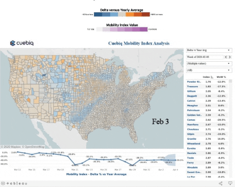
I think it says good things about our country that the drastic shift to blue occurred even before most states issued shelter at home orders.
No comments:
Post a Comment