NOTE: I just added a Subscribe button on the bar to the right of this post for those who want to get new posts automatically by email or other services.
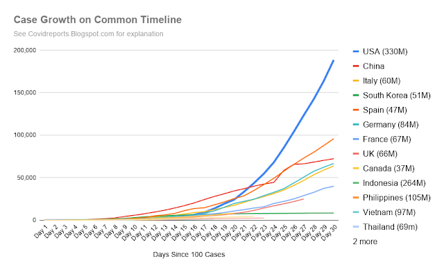
If you've been following this blog, your next question is probably "what did the growth in tests look like"? It turns out that our test growth has also grown much faster than other countries -- we passed the 1,000,000 mark in tests yesterday. This means that most of the driver behind our high relative growth is because we're testing so much more than other countries.
Until the past couple days, not only has our total testing number gone up, but the increase in tests per day was also massive, going from 6,000 cases a day mid month to over 100,000 tests a day for the past week. This is while most other countries have barely grown the amount of testing they are doing per day.
It looks like our tests per day have leveled off, but the FDA's approval of a new two minute antibody testing kit will likely increase the test rate again once it hits the market.
Another important graph is about fatalities.
Here you can see that on day 30, our fatality rate is significantly better than Italy and Spain, despite having much higher case counts than them. It also helps to put things in perspective of relative population. The US is many times larger than most of the countries we're comparing to - a little more than Italy, Spain, Germany, France, and the UK combined.
Here's our case count per 1M people:
And here's our fatality count at that scale:
Although we've been rapidly growing our testing, graphing tests on population makes it clear why we had to:
We've come closer to Italy's pace but will need to increase testing even more to be where we should be.
I also have an update on the impact of temperature and humidity on COVID growth. The trend lines for equatorial and southern hemisphere countries continue to trend very differently from northern ones -- if its due to temperature, the yellow and purple lines should change as we move towards summer in the north and winter in the south.
 |
| Click to Enlarge |
After I posted this graph, I got an interesting note from a friend.
My daughter was in China last December. She left China mid January for a scheduled three week vacation with the group she was with. She traveled to Singapore, Indonesia, Chaing Mei, Thailand. She then travelled to Koh Lanta, Thailand where I actually joined them from Feb 3-10. The initial plan was for the group to return to China after that trip. However, the day I left, they were diverted to Bangkok then sent back to Thailand. The group was kept together there -- several hundred. She finally returned home last Sunday. NONE of the group members have Covid 19, thankfully. It was unbelievably hot everywhere they traveled -- 95 degrees plus every day. I was there and it was sweltering.
While an anecdote is not the same as proof, my friend's account supports the idea that temperatures and/or humidity affect the rate at which COVID spreads.
Many people are probably wondering "we've been on lockdown for a couple weeks, when will we see the curve start to flatten?" I hope to have a post on that later today.


No comments:
Post a Comment